Friday, 5 February 2010
How i made my magazine
Front Cover

Contents Page
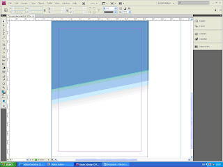

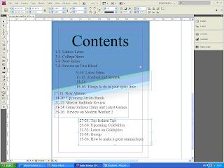

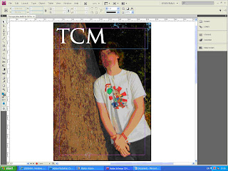
I first bridged the image into indesign from Photoshop and made it a4 size.

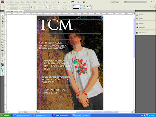
I then added the title of the magazine to the top left of the Page. This is because it is a conventional place to find the title of a magazine.

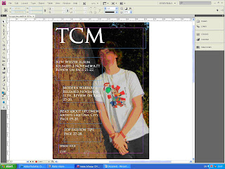
I then added tag lines to the left side of the page because the tree gives a background to it.

I then added a price and what issue it was.
Contents Page

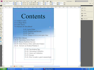
I added the background to the page.

I then titled the page with Contents. I put the title at the top of the page because that is a conventional place to have a title.

I then added all the contents list. This was the final change I did to my contents page.
How i edited the Image
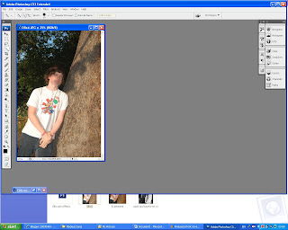
First I started to crop the image. I cut about a quarter of the image off because by cropping the image it makes you focus more on the model In the image.
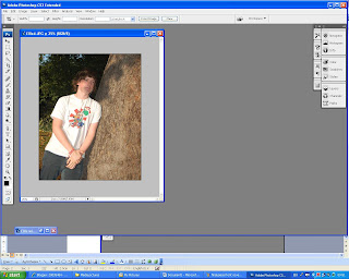
This is what happened once I have cropped the image it shows the model.
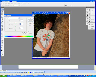
I then adjusted the saturation to -4. Adjusting the saturation made the colours more vibrant.
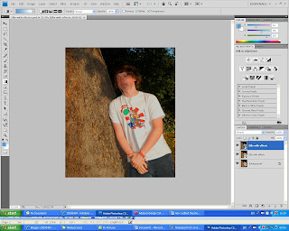 This is the final change i did to my picutre i flipped the image. The reason i chose to flip the image is because i wanted the writing on the left of the magazine.
Subscribe to:
Comments (Atom)
