Friday, 7 May 2010

Feedback Evaluation

From my feedback I found out that my magazine has achieved the target audience of 15-25 year olds. When I asked what kind of music being promoted? From the replies they all said metal and one reply said about the acoustic guitar on the front. The reason I had an acoustic guitar is because I didn’t have access to an electric one. From the feedback I have been given I think I have done a good job with keeping with the genre, the feature article, and the text throughout my magazine.

On the front cover it shows a menu which gives them a bit of information that is included in the magazine. In the feedback I was given a reply saying that there is a lot of content I added the menu on the front so that the viewers didn’t have to look into the magazine to find out about what is included in the magazine it was mostly band names with page numbers next to them to show what bands where included in the magazine.

The feedback says that I have made the magazine appealing to look at, from the feedback it shows that the magazine isn’t boring to look at and that there is a wide enough range of items on the content page because I got positive replies from all my feedback.

All of them said that if they found the magazine on the train they would pick it up and read it if they found it but not all of them said that they would buy it because they don’t usually buy music magazines.

The feedback shows that I have made my feature article interesting and that the one image that I did include on the feature article wasn’t always seen by the people that are looking at it. One of the replies I got said that there wasn’t an image on the feature article this means that the image that I did include wasn’t that noticeable and that I should of made it stand out a bit more.

From the feedback I have had positive responses from most of the people they picked up on some good points about the acoustic guitar and the image on the feature article. Most of the feedback shows that I have stuck to the genre well and kept to the music magazine codes and conventions.

Final pictures

These are my final edited photos


I add a black background to all of them apart from the T-shirt photo because it would have blended with the black background of my magazine.


Rough Photos

These are some of the photos that i took:


I choose to use this picture because it showed the box in better detail than the other picture so i chose this over that one.


With this picture i checked it after i took this photo and it seemed just right so i didnt take any more photos.


I decided not to use this picture because it cut out part of the t shirts sleeve.


I have chosen to use this one because it will fit with onto my front cover and it shows more of the guitar than the other pictures that i took.


I chose not to use this image because it doesnt show as much of the guitar as the previous photo does and it is at a slight angle rather than the prvious which is straight on.

Thursday, 6 May 2010

Text for Feature Article

2 words, Heavy and Metal, Normally around 100 acts play. And they are the very best of metal and rock. The main acts this year about going to be Metallica, Slipknot, Rage against the machine and System of a down. Other bands that are expected to play but not confirmed yet are Escape the Fate, Korn, HIM and many more. If you are attending you will want to look out for the upcoming band falling in reverse. The concert takes place at Donington Park in Leicestershire and lasts for 3 days from Friday to Sunday. Tickets can be bought off the official Download website.

This year the main act to see is Rage against the machine who reached the top of the Christmas charts in 2009 with the song “Killing in the name of” beating Joe McElderry the Xfactor winner by 50,000 copies. They are also doing a free concert at Finsbury Park on Sunday 6 June to thank people for getting them to number one.

The concert last over 5 nights. The campsite opens on a Wednesday and closes on a Monday, and the arena opens on Friday. They are very strict on rouge camping around the time of the festival anyone found on private property can be arrested by the police. There is parking at the camp site. If you have a weekend ticket you get a wristband so that it is easier to pass in and out of the concert.

The campsites have :

• Toilets
• Parking
• ATM machines
• CafĂ©
• Off sales bar and catering units
• Full secure with fences, Security guards, first aid provision and an information centre.

In previous years the tickets have had codes on them to download some tracks from the bands that are playing at the festival. The first download festival was held in 2003 there headliners were Iron maiden and Limp Bizkit but limp Bizkit pulled out and were replaced by audioslave.

Wednesday, 17 March 2010

Target reader profiles and focus group

In the focus group we found out that not many people buy magazines and that if they like the magazine they would usually subscribe to it. We also found out that not as many people buy music as there is people downloading it illegally. The main cause of people downloading music is that they don’t have money to spend on buying the albums.

Jeff
Age 17
Location: Newcastle
Interests: Going out with friends, Films
Unemployed
Tall
Medium length Brown Hair


Tom
Age 20
Location: Chelmsford
Interests: Playing Video Games, Socializing
Short
Long Blue Hair

Paul
Age 25
Location: London
Interests: Socializing, Music
Self-Employed
Short
Black Long hair

Research into specific magazines/ potential competition

I researched two other magazines NME and Q I found out that NME is released weekly and is £2.30 and has around 66 pages. Q is monthly and has 100pages and cost £3.90. I used this information to decide how many pages a fortnightly magazine would be and the price of it. Q sells approx 130,000 a month and NME sells approx 60,000 Every Week.

The Press Complaints Commission

I will make sure I will abide by The press complaints commission code. I will make sure that I have consent from the models to take pictures. Make sure everything I publish is accurate.

What goes into a music magazine – typical features in any music magazine?

The typical features of any music magazine are about the upcoming bands, reviews on new albums that have been released. Usually an interview with a band. They have a lot of adverts in a magazine usually 1/3rd of the magazine is adverts. The most typical feature is reviews on bands and Albums.

Friday, 5 February 2010

Blank

How i made my magazine

Front Cover


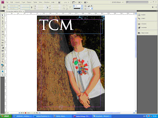
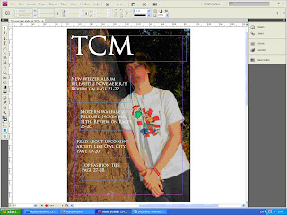
I first bridged the image into indesign from Photoshop and made it a4 size.


I then added the title of the magazine to the top left of the Page. This is because it is a conventional place to find the title of a magazine.


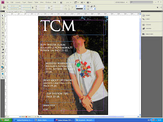
I then added tag lines to the left side of the page because the tree gives a background to it.


I then added a price and what issue it was.


Contents Page


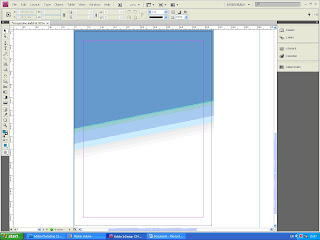
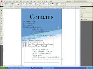
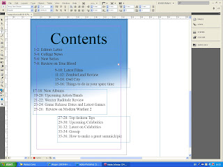
I added the background to the page.


I then titled the page with Contents. I put the title at the top of the page because that is a conventional place to have a title.


I then added all the contents list. This was the final change I did to my contents page.


How i edited the Image


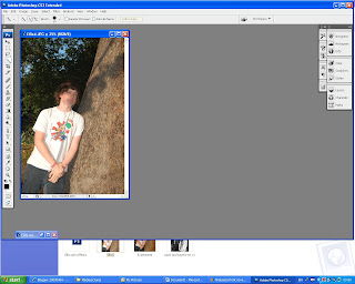
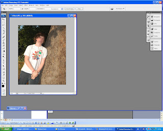
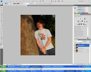
First I started to crop the image. I cut about a quarter of the image off because by cropping the image it makes you focus more on the model In the image.


This is what happened once I have cropped the image it shows the model.


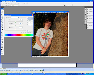
I then adjusted the saturation to -4. Adjusting the saturation made the colours more vibrant.


This is the final change i did to my picutre i flipped the image. The reason i chose to flip the image is because i wanted the writing on the left of the magazine.


Final Piece Front page and Contents page


Monday, 25 January 2010

Evaluation

The magazine is like an official magazine in the way that it has most of the conventional things of a magazine it has a mast head and a main image but it is quite unconventional because it doesn’t have a tagline or a strap line. I have stuck to blue and white as my main colours.

The audience for my magazine is teenagers the main image on the front of the magazine cover is a teenager at the college the magazine is aimed towards. The age group is 16-20 this is because you have students that are 16 and above in the college. But it might not appeal to some of the older students that attend the college. I addressed my audience by having stories they would like to hear about and having a teenager on the front cover shows it is towards a teenage audience. The media product represents teenagers because the main image has a teenager in it but doesn’t give a bad representation because the teenager in my main image is not doing anything wrong the colours in the image are bright and vibrant.

My magazine represents students it doesn’t give a bad representation because the student in the photo is not doing anything wrong he is leaning against a tree listening to music. He looks like an ordinary student nothing different about him that’s gives a miss representation.

The magazine would be sold in and around college it could be sold in the cafeteria because lots of people are in and out of there all the time. It would be the easiest place to sell the magazine because of the exchange of money.

In the process of making this media product I have learnt how to use indesign to create a piece of work and I have also learnt how to use Photoshop. I had never used Photoshop before but I believe that during this project I have learned to use it effectively to create a piece of work.

I think that I have done well learning to use the new technologies during this project I have learnt the basics of indesign and also Photoshop. I am pleased with the main image I produced using Photoshop to edit the photo and putting my magazine together on indesign.

For my next project I will compare my media product with a professional one to make sure I have all the conventions of a professional media product. Another thing I will do is spend more time on it rather than just using lesson times to create it. Also have someone look through it to show me what I could improve about the project and what is good about it.

Thursday, 14 January 2010


I edited this photo by cropping it so that it focuses more on the person in the image. I increased the saturation it makes the image more vibrant. I